Switcher Widget
A Switcher shows a number of navigation toggles and their related content items. Switchers are useful when showing little tabbed navigations and similar.
-
Beautiful Design
Lorem ipsum dolor sit amet, consectetur adipiscing elit, sed do eiusmod tempor incididunt ut labore et dolore magna aliqua. Ut enim ad minim veniam, quis nostrud exercitation ullamco laboris. -
Content Management
Lorem ipsum dolor sit amet, consectetur adipiscing elit, sed do eiusmod tempor incididunt ut labore et dolore magna aliqua. Ut enim ad minim veniam, quis nostrud exercitation ullamco laboris. -
Fully Responsive
Lorem ipsum dolor sit amet, consectetur adipiscing elit, sed do eiusmod tempor incididunt ut labore et dolore magna aliqua. Ut enim ad minim veniam, quis nostrud exercitation ullamco laboris.

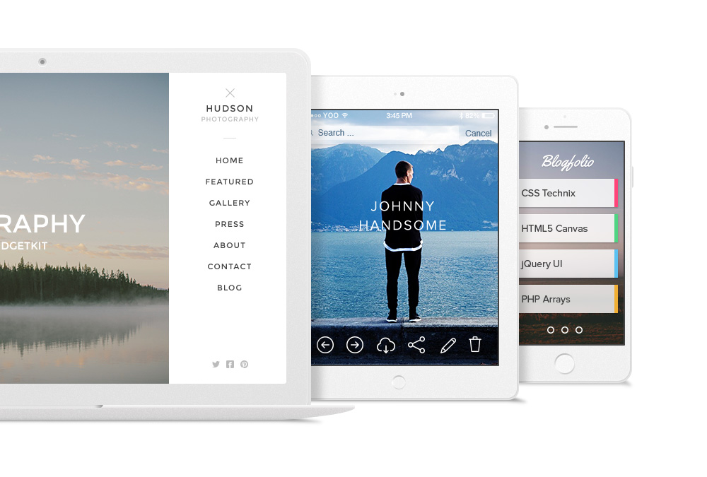
Thumbnail Navigation
Use thumbnails of each item to navigate through Switcher items. You can set thumbnail width and height and position the navigation at any side of the content.


Vertical Navigations
All navigations can be aligned vertically to the left or right of the content in addition to top and bottom. There is an option to set the width of the nav in percent.
-
Easy To Use
Lorem ipsum dolor sit amet, consectetur adipiscing elit, sed do eiusmod tempor incididunt ut labore
et dolore magna aliqua. Ut enim ad minim veniam, quis nostrud exercitation ullamco laboris.
-
Theme Support
Lorem ipsum dolor sit amet, consectetur adipiscing elit, sed do eiusmod tempor incididunt ut labore
et dolore magna aliqua. Ut enim ad minim veniam, quis nostrud exercitation ullamco laboris.
-
Fast & Lightweight
Lorem ipsum dolor sit amet, consectetur adipiscing elit, sed do eiusmod tempor incididunt ut labore
et dolore magna aliqua. Ut enim ad minim veniam, quis nostrud exercitation ullamco laboris.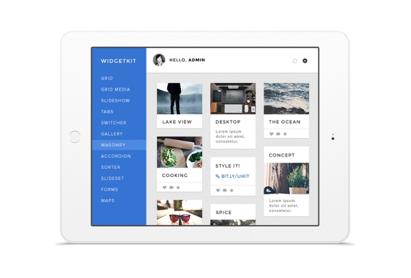
-
Beautiful Design
Lorem ipsum dolor sit amet, consectetur adipiscing elit, sed do eiusmod tempor incididunt ut labore
et dolore magna aliqua. Ut enim ad minim veniam, quis nostrud exercitation ullamco laboris.
-
Image Management
Lorem ipsum dolor sit amet, consectetur adipiscing elit, sed do eiusmod tempor incididunt ut labore
et dolore magna aliqua. Ut enim ad minim veniam, quis nostrud exercitation ullamco laboris.
-
Fully Responsive
Lorem ipsum dolor sit amet, consectetur adipiscing elit, sed do eiusmod tempor incididunt ut labore
et dolore magna aliqua. Ut enim ad minim veniam, quis nostrud exercitation ullamco laboris.
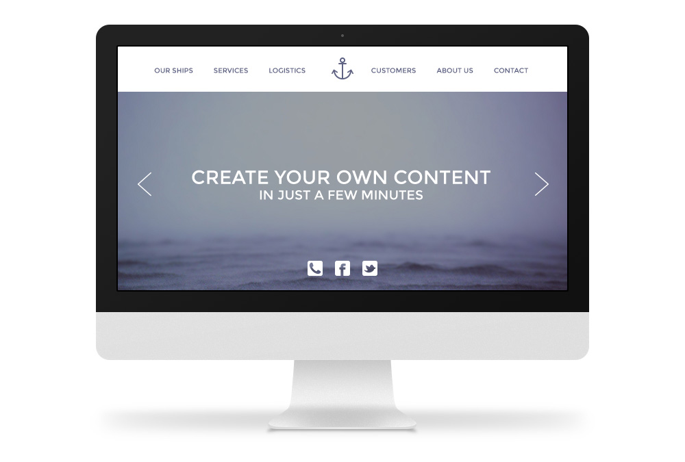
Tabs and Positions
You can also apply a tabbed navigation to the Switcher, which can be positioned at any side of the content. Tabs can be justified or aligned to the left, right or center.


Navigations
The Switcher includes different navigations like text, nav, tabs or thumbnails to toggle Switcher items. Each navigation provides different position and alignment options.
-
Shop
Lorem ipsum dolor sit amet, consectetur adipiscing
elit, sed do eiusmod tempor incididunt ut labore
et dolore magna aliqua. -
Lifestyle
Lorem ipsum dolor sit amet, consectetur adipiscing
elit, sed do eiusmod tempor incididunt ut labore
et dolore magna aliqua. -
University
Lorem ipsum dolor sit amet, consectetur adipiscing
elit, sed do eiusmod tempor incididunt ut labore
et dolore magna aliqua.
-

Brandon Cooper
Lorem ipsum dolor sit amet, consectetur adipiscing
elit, sed do eiusmod tempor incididunt ut labore
et dolore magna aliqua. -

Ethan Brooks
Lorem ipsum dolor sit amet, consectetur adipiscing
elit, sed do eiusmod tempor incididunt ut labore
et dolore magna aliqua. -

James Bell
Lorem ipsum dolor sit amet, consectetur adipiscing
elit, sed do eiusmod tempor incididunt ut labore
et dolore magna aliqua.
Additional Fields
Some of the elements that you can display inside a Switcher widget first need to be defined by creating an additional field inside the Content Manager.
| Field | Description |
|---|---|
| Social Links | Available social fields are Email, Facebook and Twitter. |